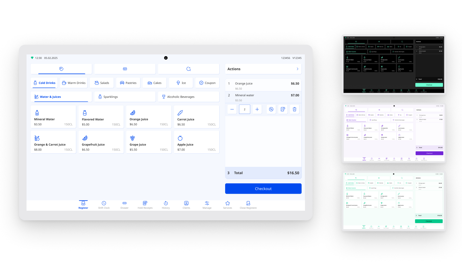
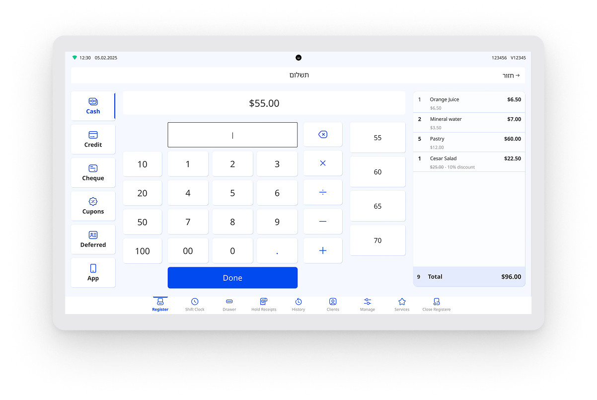
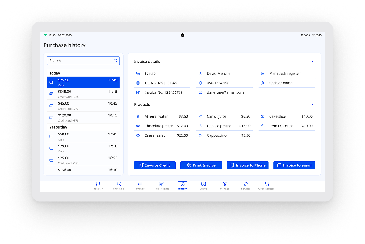
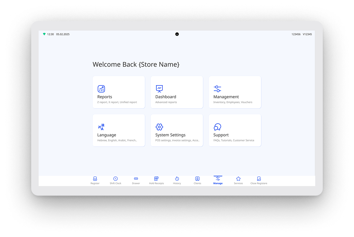
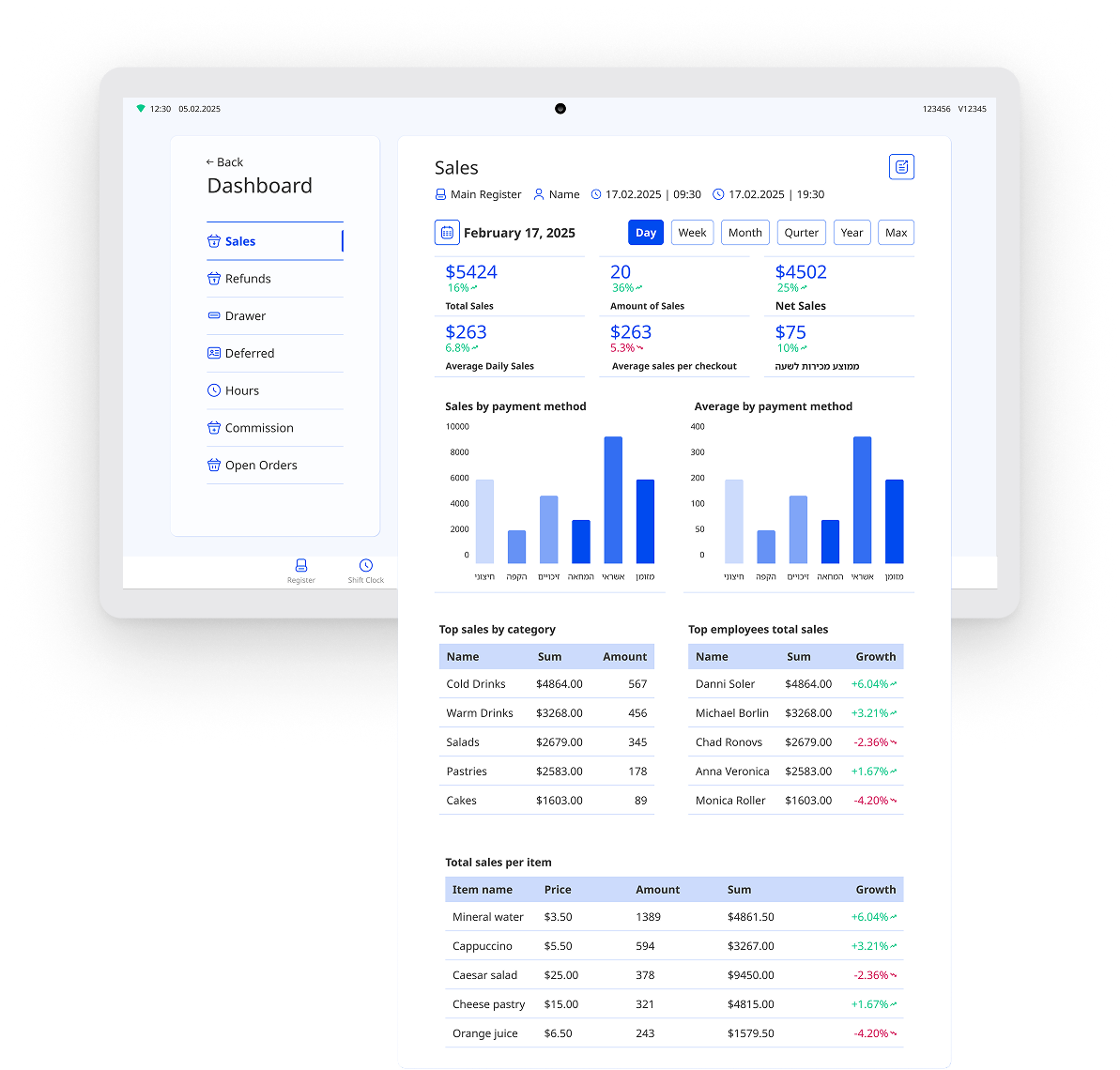
Back
POS Redesign

Redesigning a web-based POS for Android, consistency, and future scale

A UI/UX redesign for an existing POS product moving from web to Android, focused on clearer workflows, stronger consistency, and a design system for future features.
Product Design Consultant / UI/UX Designer
SaaS / Point of Sale
Android
UX/UI, Android redesign, workflow improvement, design system, information hierarchy
Dashboard mockup

The challenge

The company already had a web-based POS product, but the interface had grown inconsistent over time. As the product moved to Android, the team also wanted to improve the experience, align it with the parent brand, and create a stronger foundation for future features.

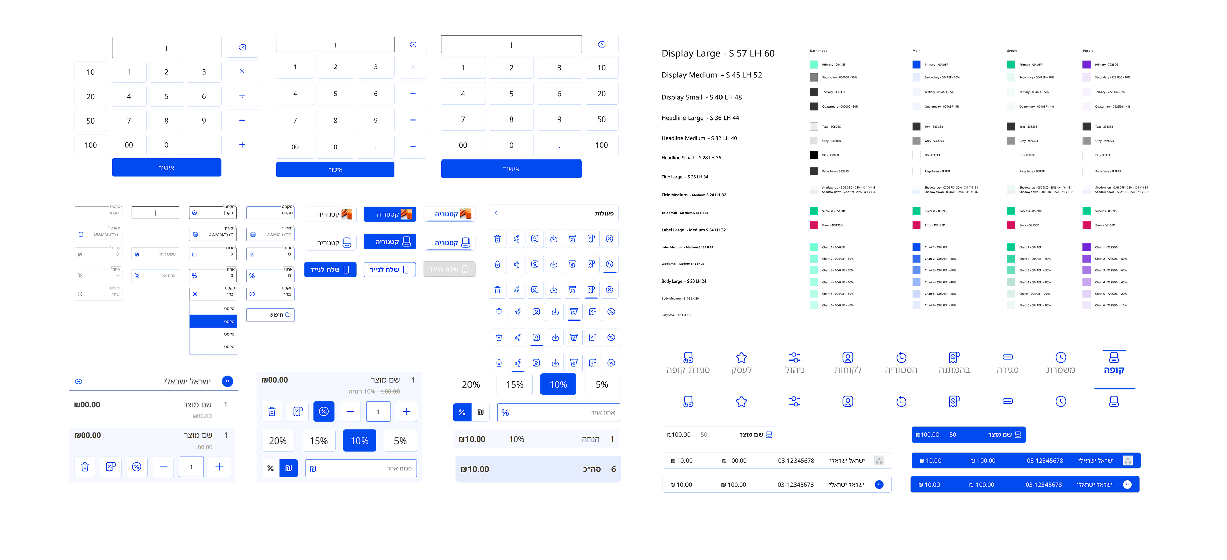
The existing product had inconsistent UI, missing states, unclear edge cases, and workaround-style solutions when new features were added. There was no design system to support consistency, which made the product harder to scale.

What I designed

I worked closely with the PM to redesign the POS experience, including the Android product structure, checkout flow improvements, product and category navigation, missing states, reusable UI components, design system foundations, brand-aligned UI, and handoff materials.

Key product decisions

Used the Android migration as a product reset

The move from web to Android created an opportunity to rethink the product structure instead of carrying over the old interface. I redesigned the experience to feel clearer, more consistent, and better suited to Android use.

Reduced confusion in key workflows

Parts of the checkout flow and product/category navigation needed clearer structure. I simplified steps where possible, made important actions easier to find, and reduced the chance that users would miss something.

Created a design system where none existed

The old product did not have a consistent system, so new features often looked like workaround solutions. I created reusable components, clearer states, and interaction patterns to make the product more consistent and easier to extend.

Aligned the product UI with the parent brand

The redesign also needed to fit the broader company brand. I adjusted the visual system so the POS felt more connected to the company identity while still staying practical for daily use.

How I worked

I worked with the PM to review the existing product, identify UX/UI gaps, improve key workflows, and create a reusable UI foundation. The process focused on practical improvements that could support the Android version and future product growth.

Outcome

The redesign created a clearer Android product experience, improved consistency across screens, and gave the product a stronger foundation for future features.
Key outcomes
  • Improved consistency across screens
  • Reduced workaround-style UI as new features were added
  • Created a stronger foundation for future product growth
  • Simplified parts of checkout and product/category navigation
  • Created a design system where none existed before
  • Redesigned the product during its migration from web to Android