Turning a dense portfolio experience into a clearer mobile product
A client-facing iOS app designed to make portfolio information easier to access, easier to understand, and better suited to quick checks on the go.
Senior Product Designer
Fintech / Wealth Management
iOS
UX/UI, mobile product design, information hierarchy, prototyping, testing
The challenge
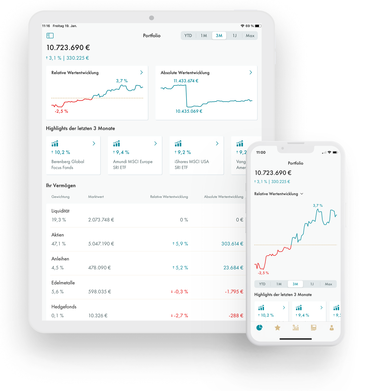
FINVIA had a web-based client dashboard with a high level of financial detail. While useful, the experience was dense and not always ideal for clients who wanted quick access to portfolio information.
The challenge was to decide what information mattered most in a mobile context, what should sit deeper in the experience, and how to make sensitive financial information feel clear and trustworthy on a smaller screen.
What I designed
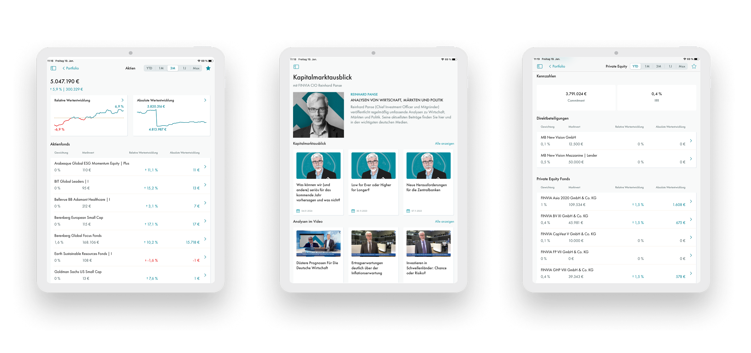
I designed the client-facing mobile experience, including the portfolio overview, performance views, information hierarchy, asset-level detail, product-level detail, mobile navigation, and post-MVP refinements.
Key product decisions
Created a lighter mobile structure
Instead of copying the dense web dashboard into mobile, I structured the app around progressive depth: main portfolio KPIs first, asset-level information next, and product-level detail later.
Improved financial readability
Performance information needed to be easy to scan and understand. I focused on clearer labels, stronger hierarchy, better grouping of metrics, and less visual noise.
Iterated after the MVP launch
The first version of the app helped test capabilities and collect feedback. After launch, the structure was refined based on user feedback and stronger iOS development input.
Used native iOS patterns where they added clarity
Working closely with iOS development helped refine the app around platform patterns that made the experience feel cleaner, more familiar, and easier to maintain.
How I worked
I worked with product, engineering, stakeholders, and iOS development input through prototyping, testing, feedback loops, and iteration. The process helped improve the structure of the app and make the financial information easier to read in a mobile context.
Outcome
The app created a clearer mobile experience for portfolio visibility and helped clients access key information more easily on the go.
Key outcomes
Simplified a dense web-first portfolio experience into a lighter iOS struxcture
Improved readability of portfolio and performance information
Used post-MVP feedback to refine the app structure
Made portfolio checking easier on the go
Received direct feedback that the app felt clearer and easier to use
Need help improving a product that feels too complex, inconsistent, or hard to scale?
I work with startups and growing teams on UI/UX, workflow redesign, and scalable design systems for digital products that need more clarity and stronger structure.