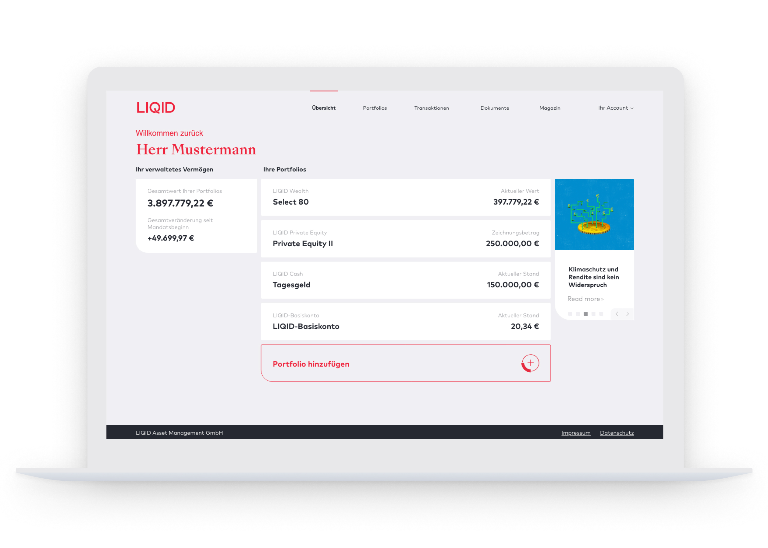
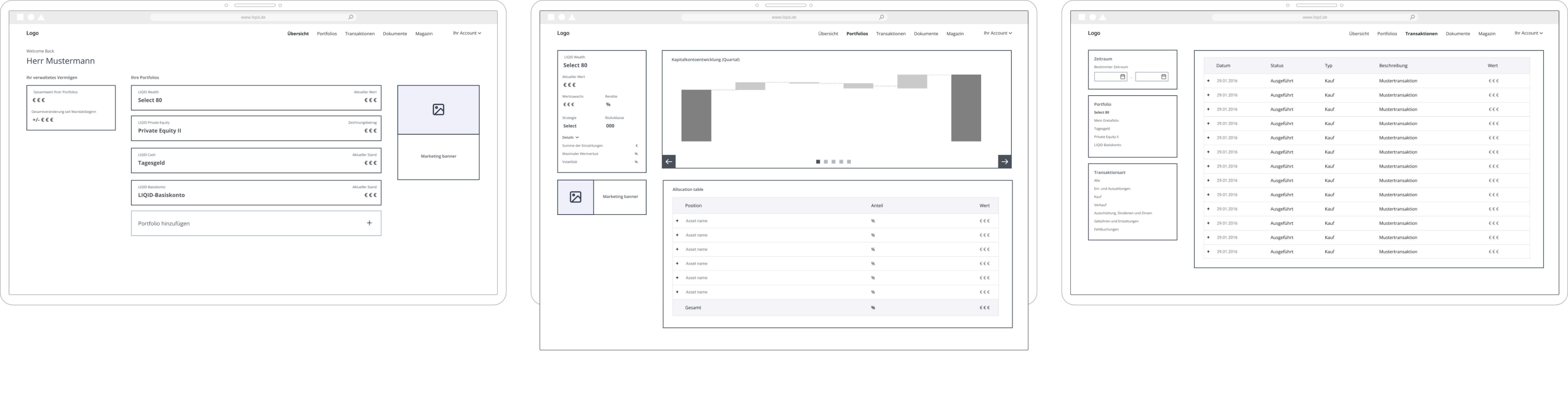
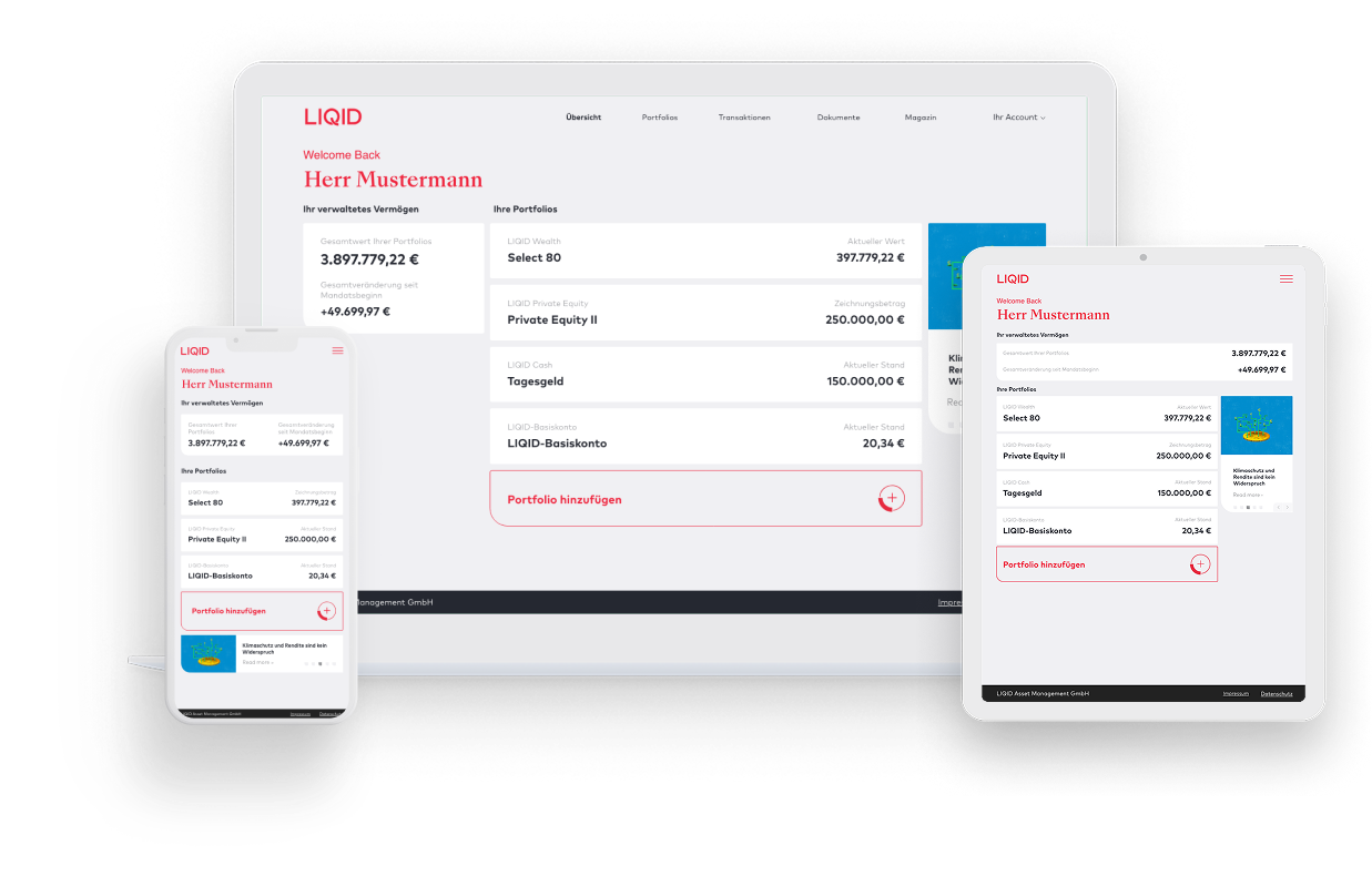
Back
LIQID Client Dashboard

Redesigning an early MVP dashboard into a clearer investor experience

A client dashboard redesign focused on improving portfolio visibility, financial readability, and trust in a more mature branded experience.
Product Designer
Fintech / Wealth Management
Web application
UX/UI, dashboard design, financial data, information hierarchy, design system
Dashboard mockup

The challenge

LIQID needed a clearer client dashboard for monitoring investments, performance, and allocation. The existing product had an early MVP-level feel and needed a more mature structure that could support a growing product experience.

The dashboard needed to show complex financial information without overwhelming clients. Users needed access to portfolio performance, allocation, reporting, and investment content, but the structure had to feel clear and trustworthy.

What I Designed

I redesigned the dashboard experience, including the portfolio overview, performance views, allocation views, interactive charts, information hierarchy, UI patterns, and design system foundations.

Key Product Decisions

Improved financial readability

I focused on clearer grouping, stronger hierarchy, and more consistent patterns so clients could understand portfolio information faster.

Moved the product beyond MVP-level UI

The redesign helped the dashboard feel more mature, structured, and aligned with the LIQID brand.

Used structure to support trust

In financial products, trust comes from clarity, consistency, and making key data easier to interpret. The redesign focused on improving how performance and allocation information was shown.

Created reusable foundations

The dashboard patterns helped support a more consistent product experience and created stronger foundations for future work.

How I worked

I worked with product and engineering through research, prototyping, testing, and feedback-based iteration. The process focused on improving the dashboard structure, making data easier to read, and aligning the product with the new brand direction.

Outcome

The dashboard became clearer, more readable, and more mature as a client-facing product experience.
Key outcomes
  • Improved hierarchy and readability of financial information
  • Made portfolio and performance views easier to understand
  • Aligned the product with the new brand direction
  • Supported a more mature client-facing experience
  • Created reusable foundations for future product work